Paramount Cuts Jobs, PepsiCo Cuts Complexity: Two Faces of Corporate Restructuring in 2025


The Merger Paradox: Wall Street vs. Human Cost in Paramount's New Reality
Why it Matters
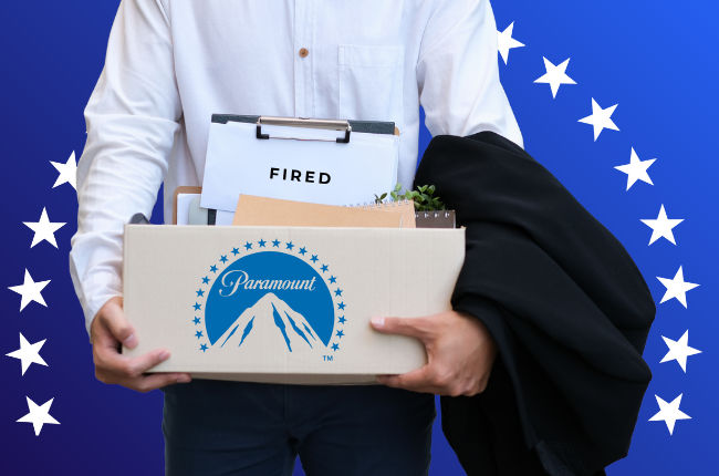
The ink is barely dry on the Paramount-Skydance deal, and David Ellison isn't wasting time: the layoffs have begun. This isn't just a corporate restructuring; it's the first major PR test for the new structure. Ellison's internal memo, framing this as a necessary step towards building a "stronger, more streamlined" company, is a classic post-merger narrative play. ✂️
From a branding perspective, this is a high-wire act. Ellison needs to project confidence and control, signaling to Wall Street and the industry that he's making the tough calls needed to compete. However, the unavoidable and grim human cost creates a significant internal and external brand challenge, with optics looking particularly bad amidst rumors of yet another ambitious acquisition bid for Warner Bros. Discovery. The immediate narrative inevitably becomes one of consolidation and cost-cutting, potentially overshadowing any talk of creative vision and risking a perception of instability just as the new entity needs momentum. It paints a picture of a company possibly being too ambitious, prioritizing aggressive expansion at the expense of its people.
Food for Thought
Mergers often promise growth yet begin with painful contraction—a difficult paradox. These early layoff decisions inevitably set the tone for the entire Ellison era at Paramount. How leadership navigates this inherent contradiction, balancing the ambition that drove the merger with the human reality of integration, sends a powerful signal about the values and culture of the new company right from the start. It’s a moment to reflect on this inherent paradox and believe
He's Back: The Clippy Glow-Up called Mico
Why it Matters
Today, I present a different kind of story. But one that has to do with branding. Microsoft is digging deep into the digital crate for its next AI play, reportedly resurrecting the ghost of Clippy as "Mico." I want to believe this isn't just an update; it's a fascinating exercise in product positioning through pure 90s nostalgia. Clippy, the universally mocked but undeniably iconic paperclip, is being strategically deployed to make Microsoft's sophisticated Copilot AI feel less like a faceless algorithm and more like a quirky, familiar blast from the past.
From a branding perspective, this is a wild but potentially brilliant move. In a world saturated with sleek, minimalist AI assistants, Microsoft is betting that irony and a shared memory can be a powerful differentiator. They're leveraging Clippy's meme status to give Mico instant personality and cultural relevance, particularly for the generations who grew up with him. I dig the strategy of transforming a symbol of past memories (and annoyance for some) into a symbol of self-aware, accessible AI, using nostalgia to build an emotional connection to their cutting-edge tech.

Food for Thought
Resurrecting Clippy is a bold nod to Microsoft's past, that's for sure. But does embracing such a universally mocked icon scream confident self-awareness, or does it risk chaining their cutting-edge AI future to a legacy of... well, trying its best but being famously quirky? Either way, I'm kind of here for it. Welcome “back”, Mico, let's see what 2025's version of Clippy has in store.
Quote of the Week
"Every time I do an interview, I think, ‘I can’t do this to myself again.’ I feel like I lose so much control over my craft when I have to do press for a movie..” — Jennifer Lawrence.

In conversation with Variety about her frustration with movie pressers.
From House of Brands to One Big Family: Pepsico's New Look
Why it Matters
PepsiCo's first corporate logo redesign in 25 years signals a significant strategic shift in brand architecture. This isn't just a cosmetic update; it marks a deliberate move from a decentralized "house of brands" (like P&G) towards a more unified "branded house" model (like Apple). The new, simplified logo is intended to act as a visual unifier across PepsiCo's diverse portfolio, aiming for greater corporate coherence.
The timing begs the question: why make this shift now? The core strategy appears driven by a need for greater control and clarity in today's increasingly complex and fragmented market. By elevating the parent brand, PepsiCo can build equity and trust at the corporate level, hoping for a halo effect across its many products, especially important when navigating complex today’s issues like sustainability or health perceptions that span the entire portfolio. Could this calculated move to streamline their overall narrative and present a single pay off with consumers, investors, and potential acquisitions, leveraging the strength and stability of the parent company more directly in a volatile landscape?
Food for Thought
The shift to a "branded house" is a used strategy for building corporate power and clarity. But here's the potential downside: does this top-down approach risk diluting the magic of individual brands like Doritos or Gatorade? Or even worst cross-contaminate other brands if health issues, recalls or regulatory issues come up? By forcing everything under one unified (and arguably more corporate) umbrella, are they sacrificing the unique cultural identities that made those individual brands icons in the first place?
Other Facts this week
📱 Reddit is the new focus group: Hootsuite explains how brands track trends before they hit TikTok (42% trust Reddit recs over influencers).
📺 NBC News launches "Facts. Clarity. Calm." campaign to fix trust crisis.
✍️ News Creator Corps on how journalism basics are now trusted with content creators